


Design system
Design system & UI components
Design systems and UI components covering buttons, inputs, colours, typography and interface states. A shared foundation keeps screens consistent and supports collaboration between design and development.
Discuss this need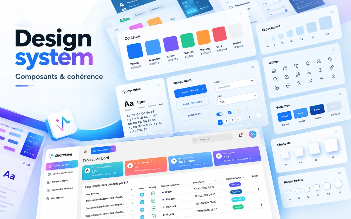
About this selection
A design system brings together interface rules and reusable elements. The visual shows colours, a spacing scale, typography, icons and different component states. Each element needs a clear purpose so it can be reused across screens. This shared foundation helps reduce visual differences and gives developers more precise design guidance.
- Visual rules
- UI components
- Documentation
Structure a design system and reusable interface components.
Define visual rules, organise components and document their states and usage.
Colour palette, typography, spacing, component library and usage rules.
Working sequence
Define visual foundations
Build components and variants
Document states and usage
Expected outcome
A shared foundation for consistent screens and clearer collaboration with developers.